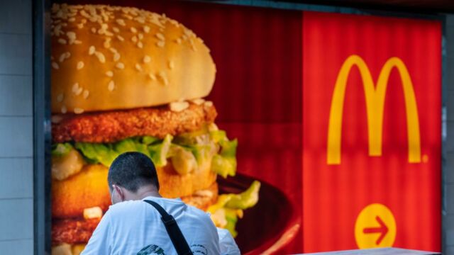
McDonald's is one of the largest fast-food chains the world, with numerous McDonald's branches strewn in many countries of the globe. In fact, the brand has some of the most unique restaurants in the world including in one case, a franchise housed inside an airplane.
Discover our latest podcast
Like it or hate it, McDonald's is undoubtedly at the pinnacle when it comes to fast-food brands, and its business and marketing model is one of the most successful and emulated in the industry. So well-curated is McDonald's image that even the most innocuous details related to the brand, has been carefully thought-out and planned, including the colour of its logo.
As reported by Reader's Digest, here is the real reason why McDonald's logo was created using its iconic bold yellow and red colours.

Read more:
⋙ Some McDonald’s have only one Golden Arch: Here’s the interesting reason why
⋙ Walmart: People are only just realising what the logo actually stands for
The reason behind the McDonald's logo
While one might assume that McDonald's logo happens to be super catchy and memorable just by pure chance, it is in fact the result of a very planned and well-thought out marketing decisions.
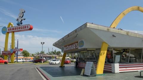
Richard and Maurice McDonald founded McDonald’s in 1940. It was in 1962 that the giant ‘M’ became part of the logo of the fast-food giant, and since then, it has stood tall as one of the most iconic fast-food branding in history.
As reported by Reader's Digest, the colours red and yellow were used deliberately because of a very specific reason: the psychological impact of colours on people. The colour red is associated with being active, it increases heart rate, giving us an appetite. One the other hand, the colour yellow suggests positivity and happiness.
In fact, the suggestive power behind this colour combination is so strong that you would notice many other brands using the same combination of colours in their logos.

Read more:
⋙ McDonald's soda tastes better than others: Here's the crazy reason why
What colour psychologist has to say
A report published by Metro, quoted Karen Haller, expert in psychology, who explained how colours could impact people. Regarding McDonald's logo colours, she explains in the report,
Red triggers stimulation, appetite, hunger, it attracts attention. Yellow triggers the feelings of happiness and friendliness.
When you combine red and yellow it’s about speed, quickness. In, eat and out again.
Along with its psychological impact, yellow is also the most visible colour in daylight, providing the McDonald's logo greater impact and visibility, along with generating a feeling of hunger.
As per the expert, with changing time and consumer behaviour changing towards being eco-friendly and environmentally-conscious, McDonald's is also leaning more towards using the colour green. Haller says,
You may have noticed that McDonalds are changing a lot of their store colours to green. Notice the different feeling this gives. Green elicits the feelings of nature, natural and environmentally friendly.
No matter the times, one thing is for sure, McDonald's sure knows what to do to keep their customers satisfied and coming back for more.
Sources used:
Reader's Digest: 'The Real Reason the McDonald’s Logo Is Yellow and Red'
Metro: 'Why the McDonald’s logo is red and yellow, according to a colour psychology expert'


